-
Shop
- Advanced Technologies
- Beauty
- Best-Sellers
- Car Accessories
- Dating & Social Skills
- Digital Resources
- AI & Technology
- AI Skills
- Car Buying & Ownership
- Cozy Feast Collection
- Electronics & Technology
- Emotional Intelligence
- Financial Education
- Hobbies
- Home Styling & Organization
- Kitchen & Recipes
- Mindfulness
- Mindset
- Online Business
- Parenting & Child Development
- Pet Lifestyle & Wellness
- Positive Thinking
- Productivity
- Self Confidence
- Sleep Improvement
- Smart Life with AI
- Stress Management & Relaxation
- Travel Planning
- Yoga & Fitness
- Yoga & Mind-Body Practices
- Education & Learning
- Family & Parenting
- Fashion
- Fashion Accessories
- Furniture
- Gadgets
- Health & Beauty
- Health & Wellness
- Home & Garden
- Home Supplies
- Kids & Babies
- Kitchen
- Kitchen Best-Sellers
- Lighting
- Patio, Lawn & Garden
- Personal Growth
- Personal Style & Fashion
- Pet Care
- Pet Supplies
- Pets
- Sport & Outdoors
- Super Deals
- TikTok Growth & Monetization Mastery
- Travel
- Wealth
- Wealth Building
- Budgeting & Saving
- Cryptocurrency Investing
- Debt Management
- Entrepreneurship & Business Growth
- Family Finance & Budgeting
- Financial Independence
- Financial Mindset & Psychology
- Financial Planning
- Frugal Living & Expense Hacks
- Goal Setting
- High-Income Skills
- Investing Basics
- Leadership
- Motivation
- Networking & Mentorship
- Passive Income Strategies
- Real Estate Investing
- Side Hustles
- Stock Market Investing
- Wellness
- Popular
- Best deals
Winter Color Palette Guide: Cool, High-Contrast Outfits
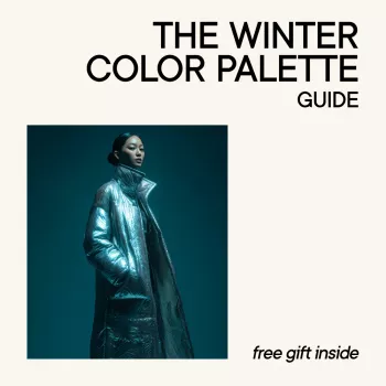
The Winter Color Palette Guide: Seasonal Color Analysis for Confident Outfits
Winter coloring is defined by cool undertones, high contrast, and crisp clarity. When clothing colors echo that cool, sharp quality, outfits look intentional with less effort—skin appears clearer, eyes brighter, and combinations feel naturally cohesive. This guide helps you recognize Winter coloring, understand the Winter subtypes, and build a wearable wardrobe using Winter-friendly neutrals, accents, and easy outfit formulas. For more guidance, see The billion-pound question in fashion E-commerce: Investigating the ….
What “Winter” means in seasonal color analysis
In seasonal color analysis, “Winter” refers to a color family that reads cool (blue-based), clear, and high-contrast rather than warm, earthy, or muted. The most reliable Winter shades look crisp and decisive—true black, optic white, saturated jewel tones, and icy pastels that feel frosted instead of dusty. For further reading, see [PDF] RED. WHITE AND ROYAL BLUE – www2.internationalinsurance.org.
The payoff is practical: fewer “almost right” pieces that never quite click, and more outfits that look polished even with simple silhouettes. Most Winters also look especially strong in sharp color boundaries (high-contrast stripes, clean geometrics, black-and-white prints) versus blended, heathered, or softly faded patterns.
For extra context on how standardized colors are defined and communicated across industries, Pantone’s reference work can be useful: Pantone Color Institute. If you’re curious about why certain colors feel energizing or heavy, this overview is a helpful starting point: Color Matters: Color and Emotion.
Quick self-check: signs a Winter palette may fit
Winter palettes tend to feel “right” when you can wear bold contrast without looking overwhelmed. A few common clues:
- Black looks harmonious (not heavy or aging), and bright white looks clean rather than harsh.
- Silver-toned metals (silver, platinum, white gold) look more natural than yellow gold.
- Jewel tones (cobalt, emerald, magenta) feel easy, while camel, mustard, warm beige, and rusty orange feel off.
- High-contrast outfits (black/white, navy/white, charcoal/icy pink) flatter more than tonal, low-contrast looks.
- Photos in warm lighting may pull skin yellow; cooler lighting tends to look more balanced.
Winter subtypes: True Winter, Cool Winter, Deep Winter, Bright Winter
Not every Winter needs the same depth or brightness. Subtypes explain whether your best shades skew icier, deeper, or more electric. If you’re unsure, start with universally strong Winter anchors—black, white, navy, charcoal, cobalt, a blue-red, and cool fuchsia—then adjust the depth or brightness based on what makes your face look most even and awake.
Winter subtype quick guide
| Subtype | Best color qualities | Go-to neutrals | Accents that shine | Colors to be careful with |
|---|---|---|---|---|
| True Winter | Cool, clear, high contrast | Black, optic white, charcoal, cool navy | Cobalt, emerald, magenta, blue-red | Warm beige, camel, tomato red, muted olive |
| Cool Winter | Coldest, icy, blue-based | Cool gray, navy, black, bright white | Icy pink, icy blue, cool berry, sapphire | Cream, warm taupe, golden browns, warm coral |
| Deep Winter | Cool + deep, dramatic | Black, ink navy, espresso-cool (very dark brown), charcoal | Deep teal, burgundy-berry, pine-cool green | Rust, warm chocolate, dusty muted shades |
| Bright Winter | Cool + very bright/clear | Black, bright white, cool navy | Hot pink, electric blue, vivid purple | Muted pastels, warm peach, soft camel |
The most wearable Winter wardrobe colors
Wearable doesn’t mean boring—it means repeatable. For Winters, the easiest closet “infrastructure” comes from cool, dark neutrals and clean lights:
- Neutrals: true black, optic white, charcoal, cool gray, ink navy.
- Signature accents: cobalt/sapphire, emerald, cool teal, blue-red, raspberry, fuchsia, royal purple.
- Icy lights (great near the face): icy pink, icy lavender, icy mint (cool-leaning), ice blue.
- Denim tip: choose dark, cool-wash denim over warm, faded, or yellowed blue.
- Prints/textures: crisp stripes, sharp geometrics, black-and-white patterns, and smooth fabrics (satin, leather, fine knits) echo Winter clarity.
Colors that commonly fight Winter coloring (and simple swaps)
When a shade conflicts with Winter coloring, it usually does one of two things: it adds unwanted warmth (yellow/orange) or it mutes contrast (dusty/gray). A few simple swaps fix most issues:
Outfit formulas that create confident contrast
A practical capsule plan for a Winter closet
Make it easy: a done-for-you Winter palette you can shop from
For a streamlined reference, The Winter Color Palette Guide | Winter Color Palette Clothing Ebook | Seasonal Color Analysis for Confident Outfits organizes Winter-friendly neutrals, accents, icy lights, and deeper shades so you can build outfits with less trial and error.
If you’re looking for a statement outerwear piece that naturally supports Winter contrast (especially in black-and-white or bold patterning), consider a high-impact layer like the Versace Reversible Jacket with Iconic Barocco Pattern.
FAQ
Can a Winter wear brown?
Yes—look for brown that’s very deep and cool-leaning (espresso/ink-like) rather than warm chocolate, camel, or tan. If the brown reads warm, wear it away from the face and keep your top layer in black, navy, or charcoal.
What’s the difference between Deep Winter and Autumn colors?
Both can be deep, but Deep Winter stays cool and clear (jewel-like), while Autumn is warm and earthy (golden and muted). For quick comparisons: burgundy-berry (Deep Winter) vs rust (Autumn), and cool teal (Deep Winter) vs olive (Autumn).
How can a Winter build outfits without wearing only black?
Use navy or charcoal as your main neutral, then add one jewel-tone accent like cobalt, emerald, or fuchsia. For contrast near the face, swap in an icy top (icy pink or ice blue) with dark bottoms.










Leave a comment